Research on navigating transit systems influences Union revamp
Union Station is getting improved signs to help casual users, and those who know Union Station well.
Aug 13, 2020
So you know Union Station.
Really know Union Station?
If that’s so, and you’re a regular user of the downtown Toronto transit hub, then you’ve likely seen – or stepped in to help – travellers who stand inside the historic building, phones in hand and confusion on their faces.
With plenty of progress and changes to Union Station, even veteran commuters may have difficulty, now and then, finding the best way to get around.
As the Bay Concourse moves towards completion, and the new Union Station Bus Terminal close to opening, how customers experience Union Station will soon be completely transformed. The opening of these two new spaces coupled with additional retail areas opening at the station presented officials with a golden opportunity to try something new to make moving through the spaces a bit easier.
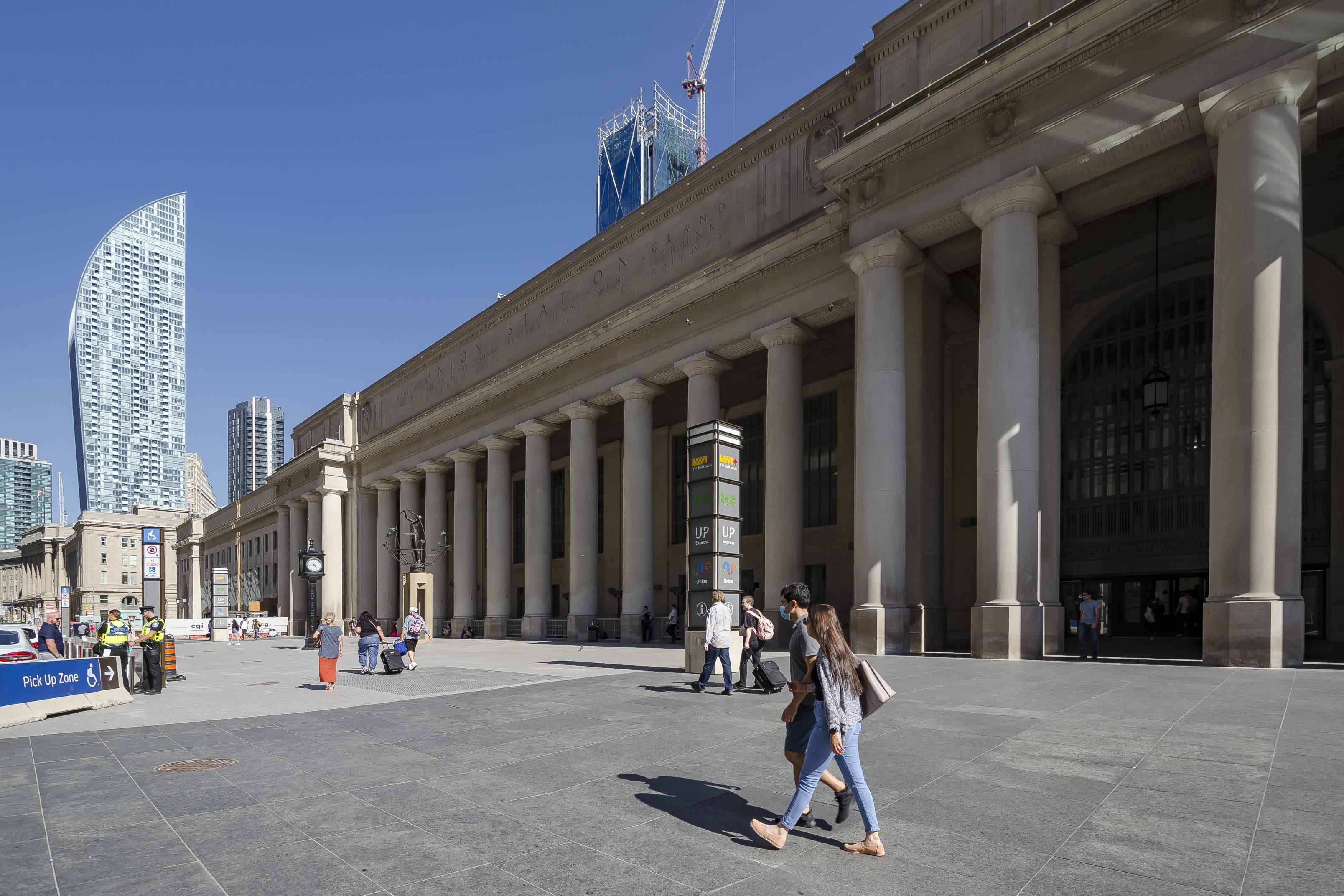
A familiar view of Toronto’s Union Station from Front Street, one that most visitors and residents instantly recognize (Jimmy Wu photo)
Customer feedback has underlined how the existing signage perhaps wasn’t performing as well as it could. In looking to tackle this problem, Metrolinx and the City of Toronto have launched a wayfinding pilot project that will focus on creating a better journey for all visitors to Union.
The plan is to introduce the new pilot signage in the York Concourse and gather feedback and input on how it’s working and make any necessary changes to improve the pilot signs even more before implementing them throughout the entire station.
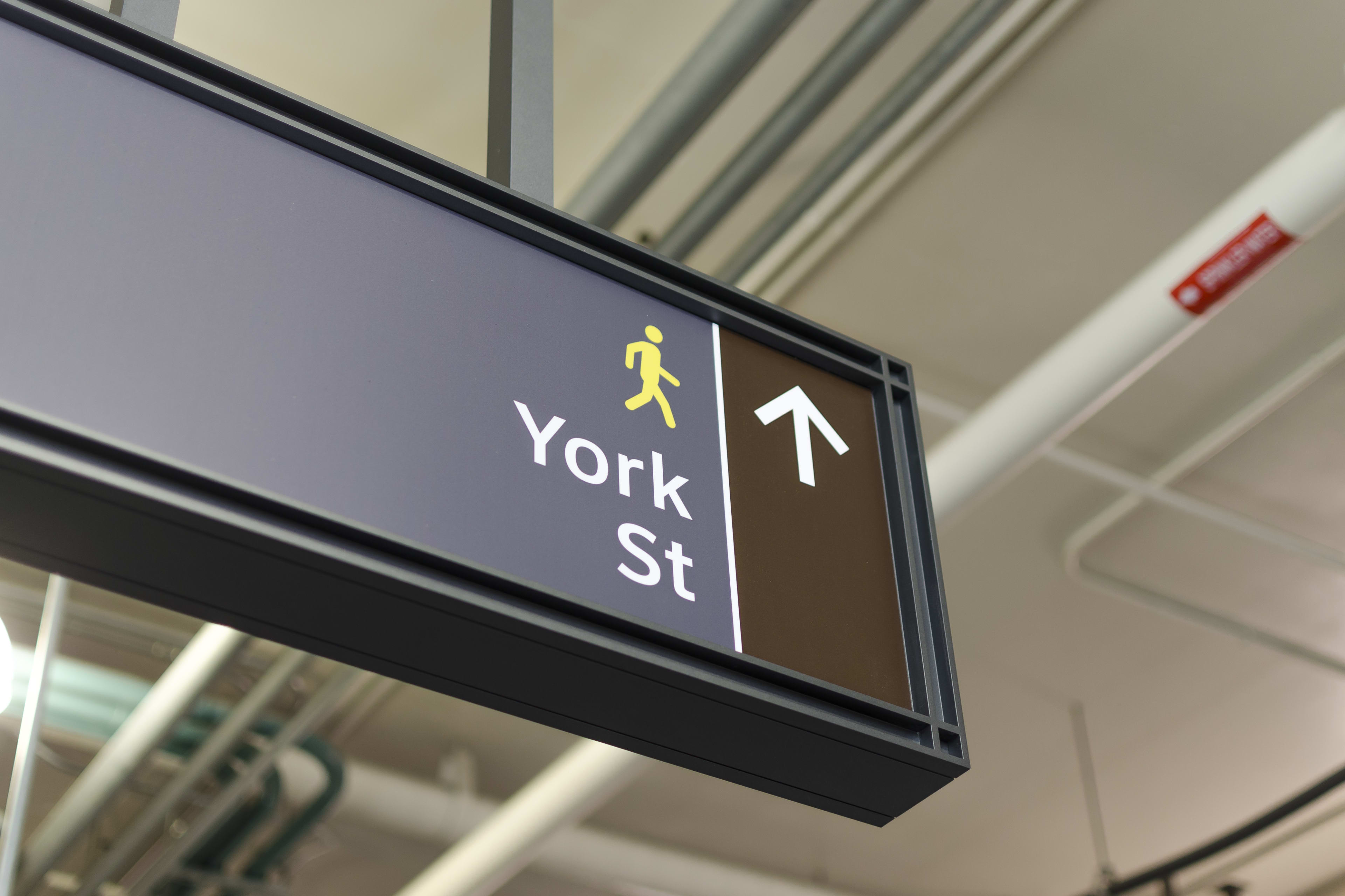
Examples of new signage directing transit users to York Street (Jimmy Wu photo)
As owners of Union Station, the City of Toronto is responsible for the signs seen throughout the facility, including York Concourse and the future Bay Concourse.
While transit is the priority at Union, it is much more than a rail station: It offers an urban shopping and culinary experience through marquee restaurants, retailers and individual food vendors showcasing the diverse flavours of Toronto’s favourite neighbourhoods.
It is a gathering place, a hub for cultural activity and for many, a gateway into Toronto and the Greater Golden Horseshoe region.
Its prominence, unique design and storied history has meant that special attention, and care, need to be given to how the signs would look, what they would say, and where they were placed.
“We weren’t trying to make this a branding exercise,” said Toban Allison, who leads the Metrolinx Wayfinding Team. “Instead, it was a conversation about what could we do to make the signage simply work better for anyone coming to the station.”
This wasn’t just a question of making a few tweaks, however.
“We have effectively developed a new way to communicate wayfinding information at Union station,” said Scott Barrett, Acting Head of Property and Asset Management for Union Station.
The development of the Union Station signage and wayfinding design began in 2008 and was a comprehensive process that included various design options, sign mock-ups and consultations with station stakeholders.
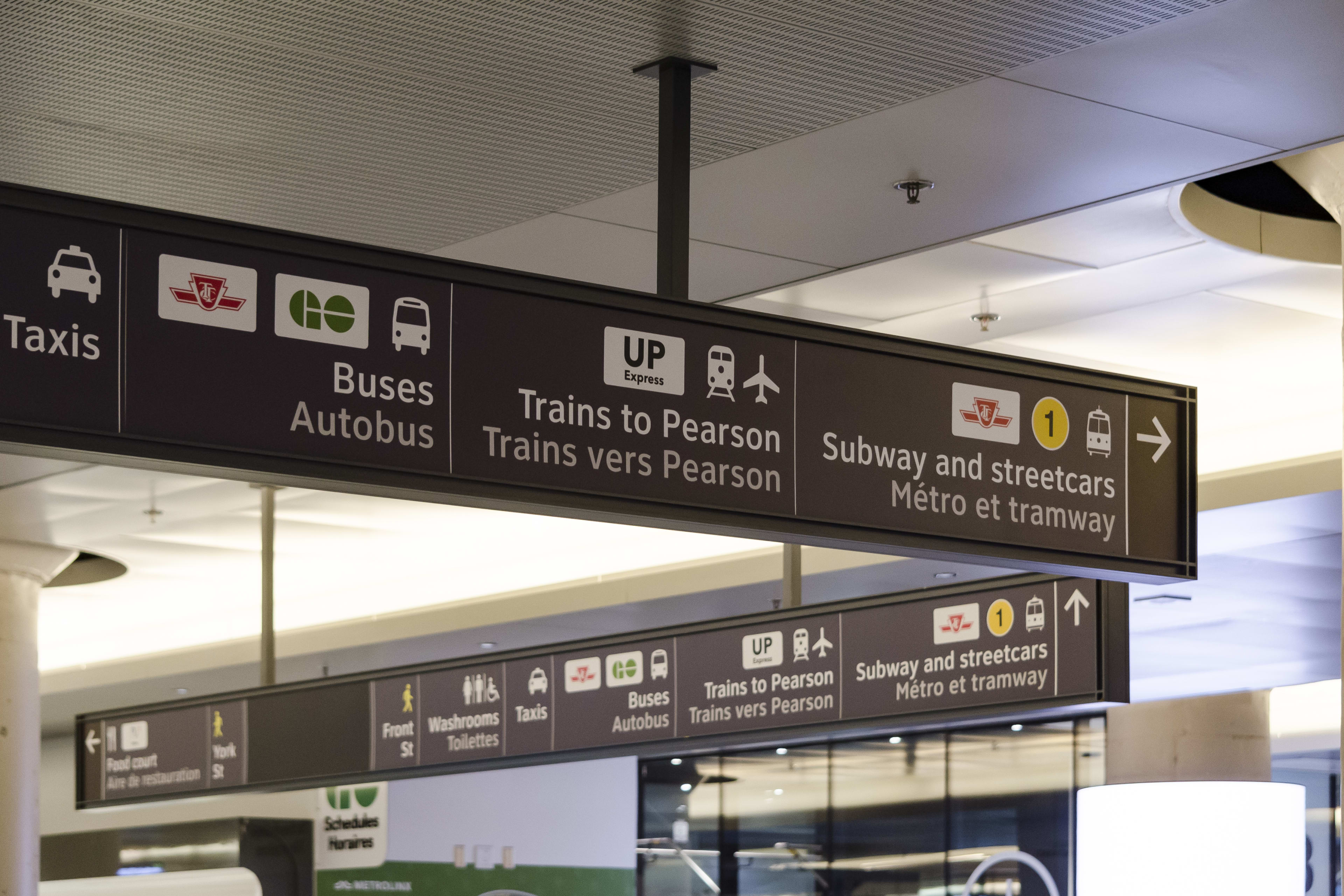
From inside the GO York Concourse transit users can make their way to the UP Express, GO Bus, TTC and many other connections (Jimmy Wu photo)
The design, including the standards and principles were approved in 2011.The new pilot project signage builds off existing designs developed in 2011 as well as the Metrolinx Wayfinding Standard, of which nearly every element was tested with customers and input from all municipal transit agencies in the GTHA.
“By building off existing signage, we were able to make meaningful improvements without starting from scratch. We’ve tried very hard not to repeat any of the existing elements that visitors found confusing,” said Barrett, adding Union Station has several stakeholders, and officials needed to ensure that any changes made were agreed upon by all, including our transit partners, retailers and other city departments.
So how is the new signage different, and how did research play a part in the changes?
Use of Text
The biggest changes customers might recognize is a move away from using pictograms and logos alone as the primary means to guide customers. Based on feedback from an earlier wayfinding pilot project conducted by Metrolinx, it was discovered this can often be confusing, particularly to newcomers, as transit operator logos may not be immediately recognizable and pictograms may not be easily understood when used on their own.
The new pilot designs use both words and pictograms as widely as possible in order to capture all types of learning styles.
New wayfinding signs inside Union Station aim to make it easier for everyone to find their way. (Jimmy Wu photo)
Focus on Mode
Services are identified by mode first, as opposed to operator, as research found mode is more meaningful to customers and more likely to be understood by a wider variety of people. For example, while the GO logo or the yellow circle with the 1 numeral may not be recognized by those who are new to the city, terms like ‘regional trains’ or ‘subway’ are likely to be widely understood.
Services Over Spaces
Lastly, the signs now direct to services instead of spaces in order to minimize the number of pieces of information provided on signs and reduce the number of things a customer has to remember when moving around.
While names like ‘York’ and ‘Bay Concourse won’t change; however, we’re prioritizing the service that can be accessed over the space that it can be accessed from.
The look and feel of the pilot project signs was developed by the City and Metrolinx through a series of workshops, and the design was executed in-house at Metrolinx.

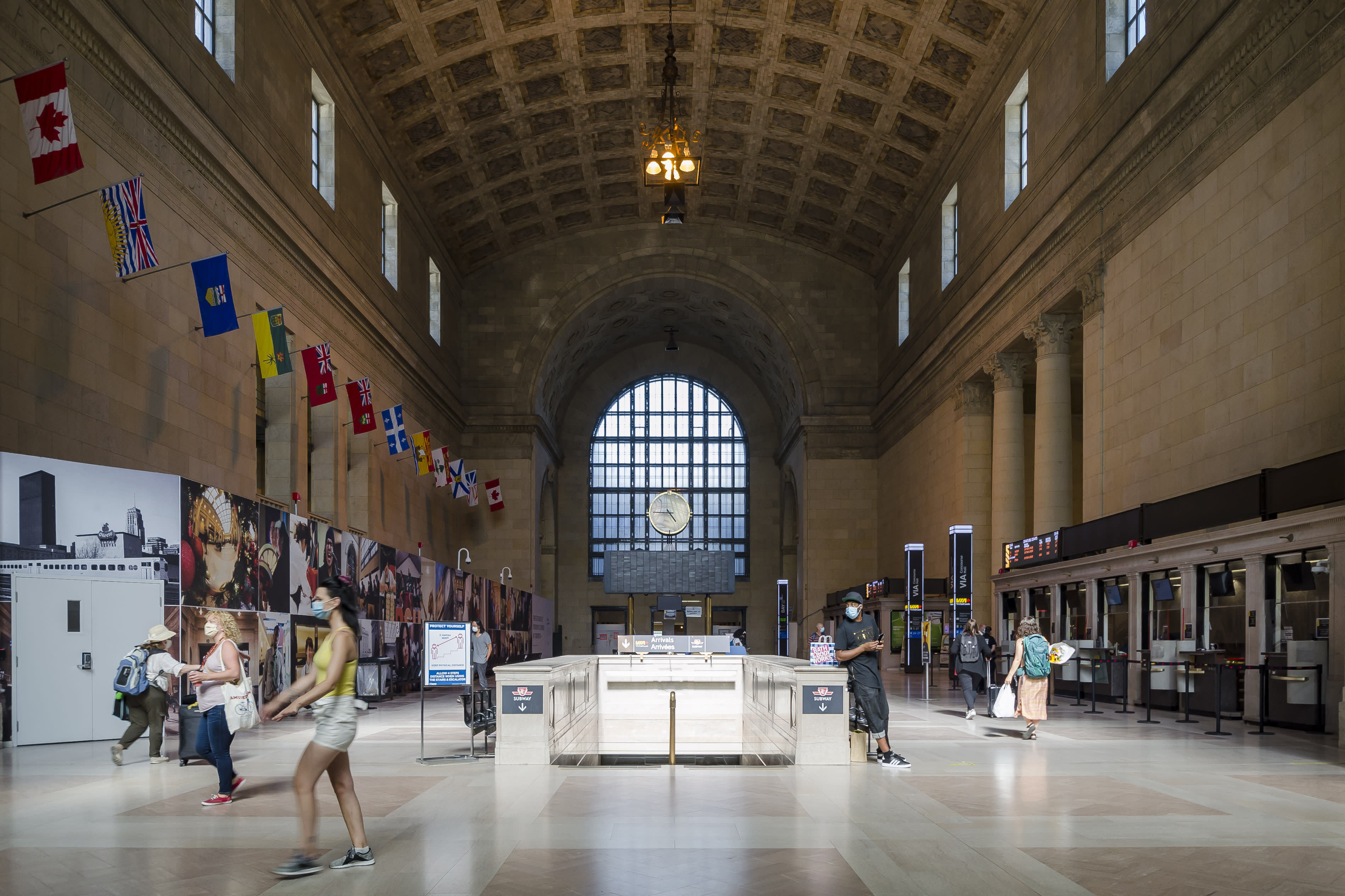
Inside Union Station’s iconic Great Hall (Jimmy Wu photo)
Travellers will notice sign messages are being replaced, but frames are being retained to keep costs down. While York Concourse is being tackled now, officials will also be making similar adjustments to Bay Concourse and Union Station Bus Terminal signage in time for the opening of each, as well as rolling out new maps and diagrams throughout both openings.
Experts are currently working on a plan for capturing and assessing customer feedback on the pilot project signage that we’ll announce in the coming weeks.
In the meantime, if you happen to be at Union Station, let Metrolinx know what you think of the new design on social media or by emailing us at wayfinding@metrolinx.com.
It may just seem like changes to signs in a transit hub that sees more than 300,000 passengers pass through each day, but for anyone who’s stood in the middle of Union Station, confused at where to go, it’s a welcome sign of positive change.
by Toban Allison Metrolinx senior advisor, Wayfinding